Hello there and happy Sunday! I hope that you are well and that you are having a great weekend! I am back today to share another new make created for the new Distress color, Prize Ribbon…did you happen to catch the Tim Holtz youtube live yesterday, announcing the new color? If you did’t you can check it out HERE. Wowza! It was like waiting for Christmas! I love seeing how Tim shares the color and hearing the excitement in his voice and seeing all the excitement that it stirs up in people…including me! Seeing the swatches and individual products then seeing the inspiration…it just gives me goosebumps! Prize Ribbon is such a vibrant blue hue and wicks out into so many shades that it is a beautiful addition to the Distress line.
Today’s sample that I’m sharing, in my opinion, really shows Prize Ribbon’s ability to wick out. Meaning, it’s ability to change tones by adding water to lighten, or adding more ink to darken. The amount of shades that this color can produce is mind-blowing!
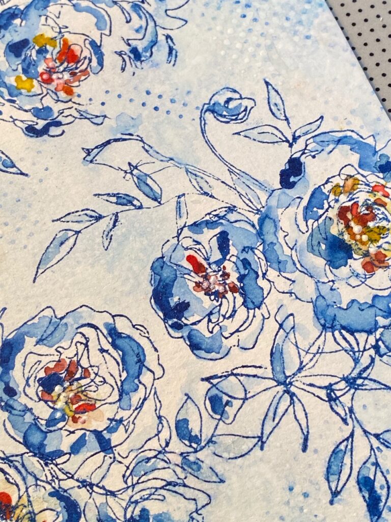
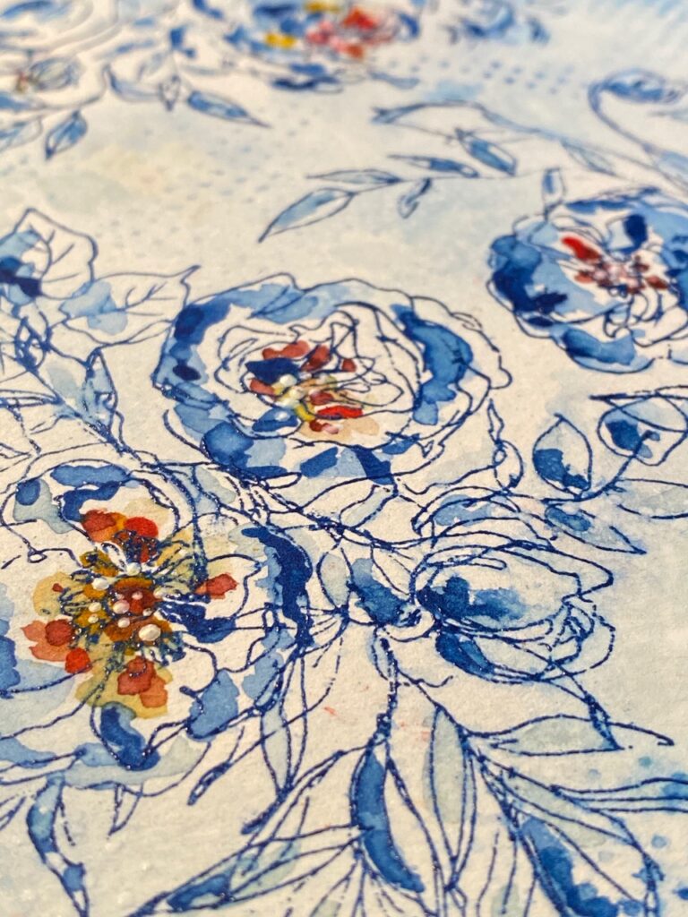
Here’s a very up-close and personal look at what I’m talking about with the wick…shade upon shade, upon shade…a watercoloring dream! My new favorite Stampers Anonymous Floral Outlines CMS430 stamp set was made for this color!
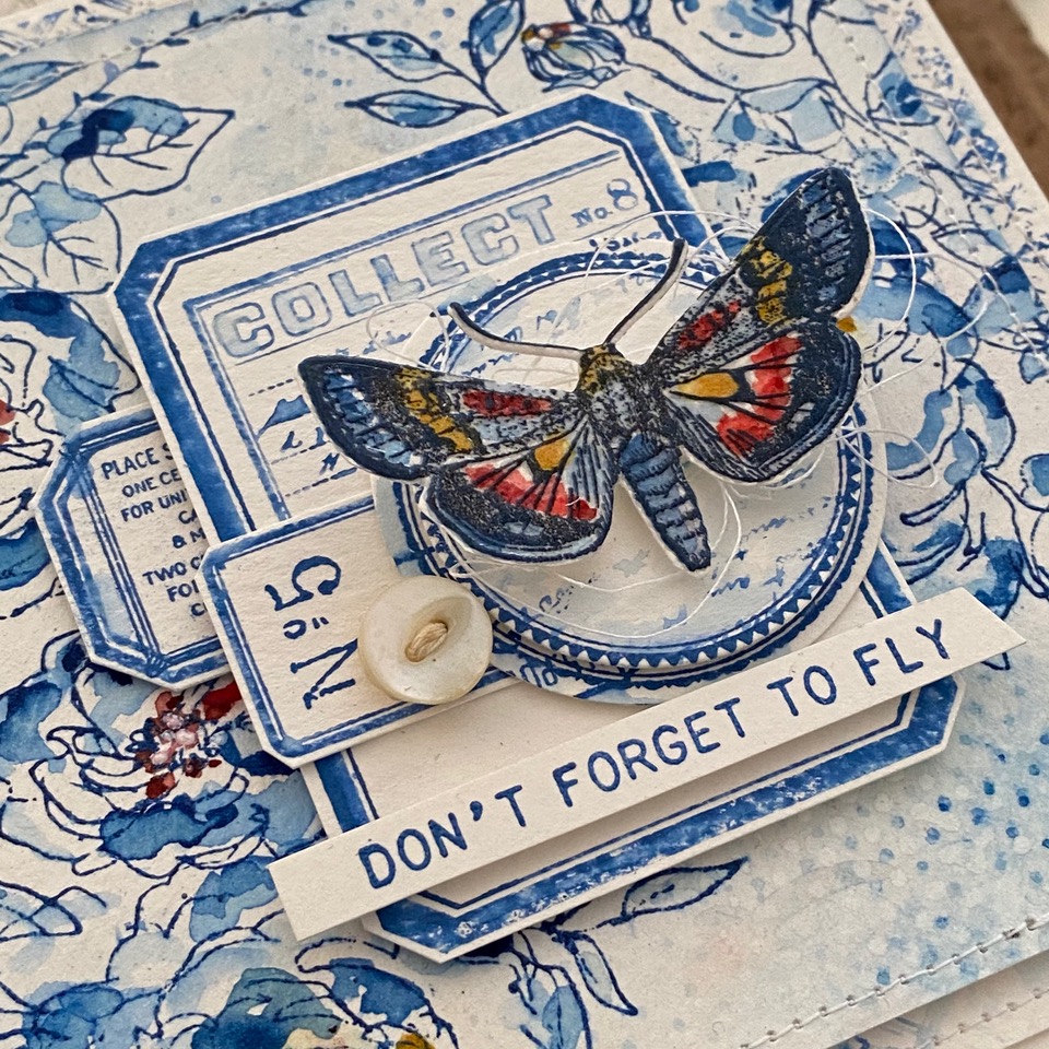
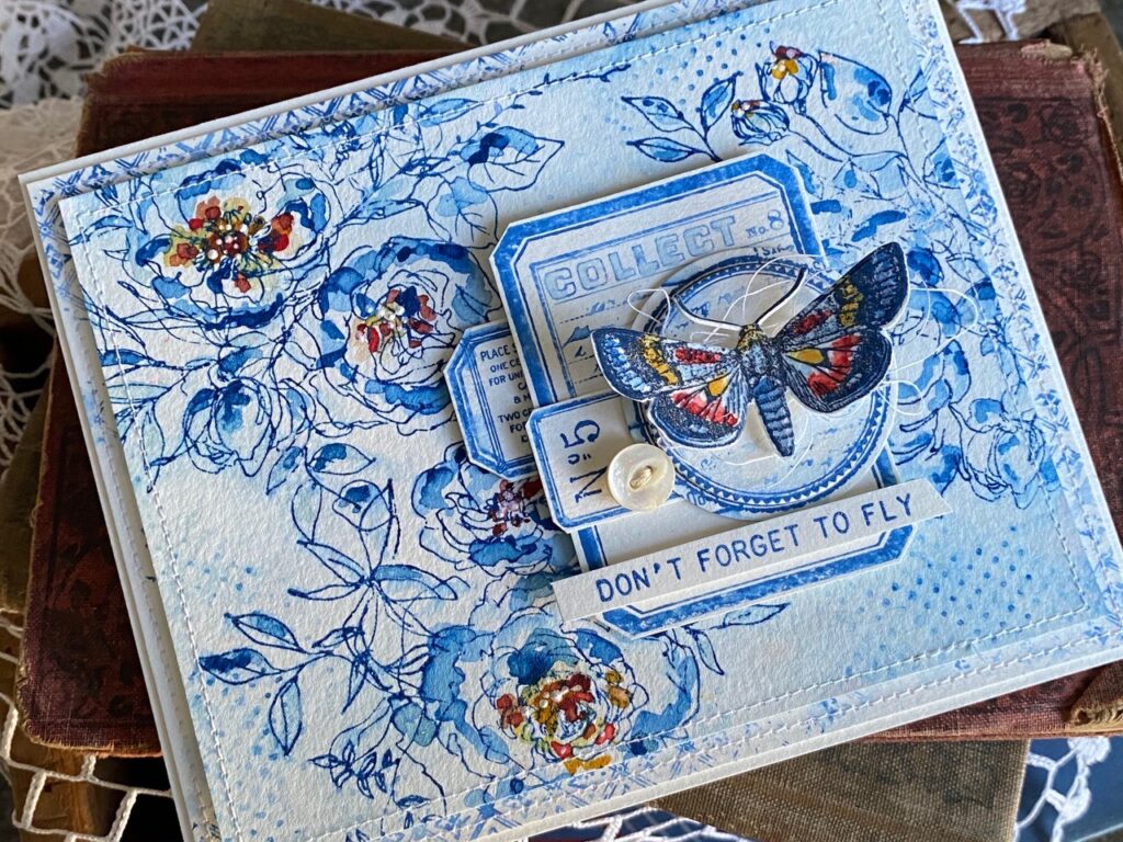
I chose to pair the flower background with some of my favorite things, labels and postage things (label frames CMS264 & correspondence CMS225), and entomology bits and a beautiful moth (Entomology CMS328 & Field Notes CMS396) in shades that coordinated with the background. (ok…so I may have gone a little crazy with the stamp sets, but a card like this is fun to coordinate several sets together, so go on a hunt and see what fun you can have by mixing sets that you already have in your collection!)
So, let’s get to it!
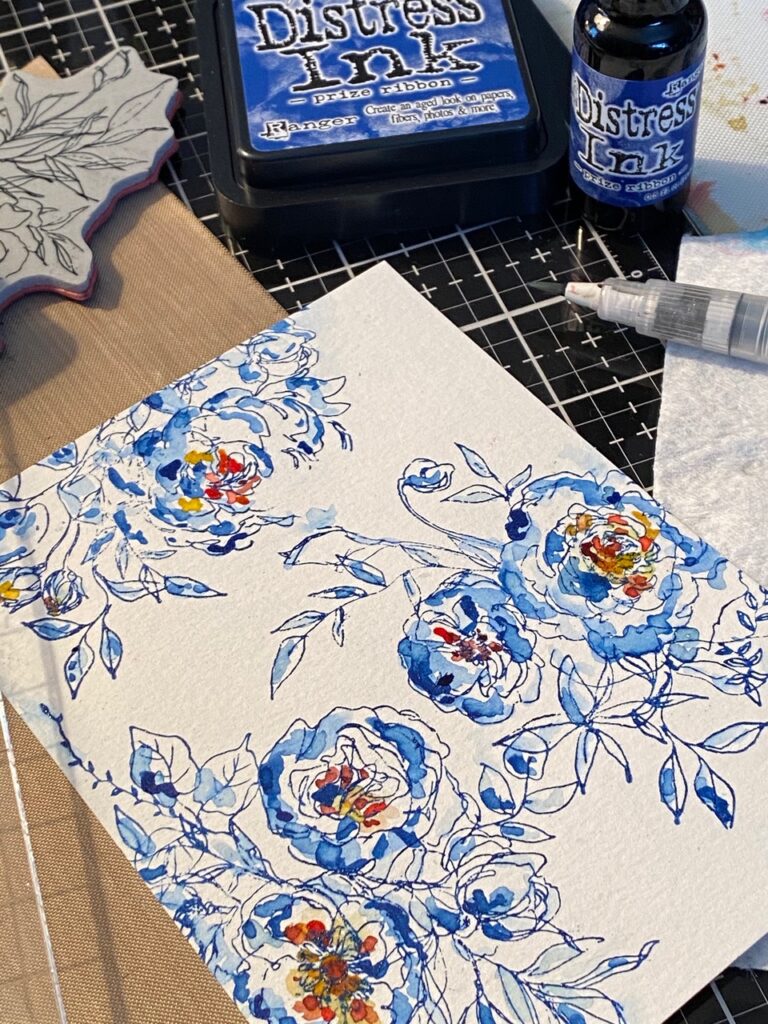
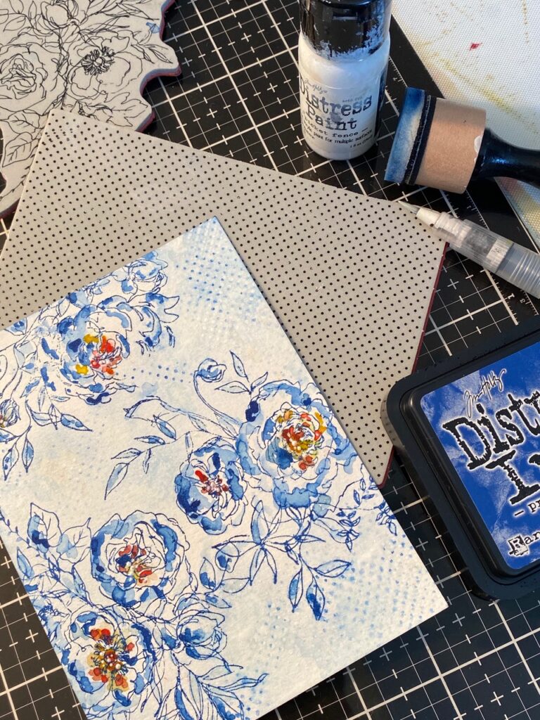
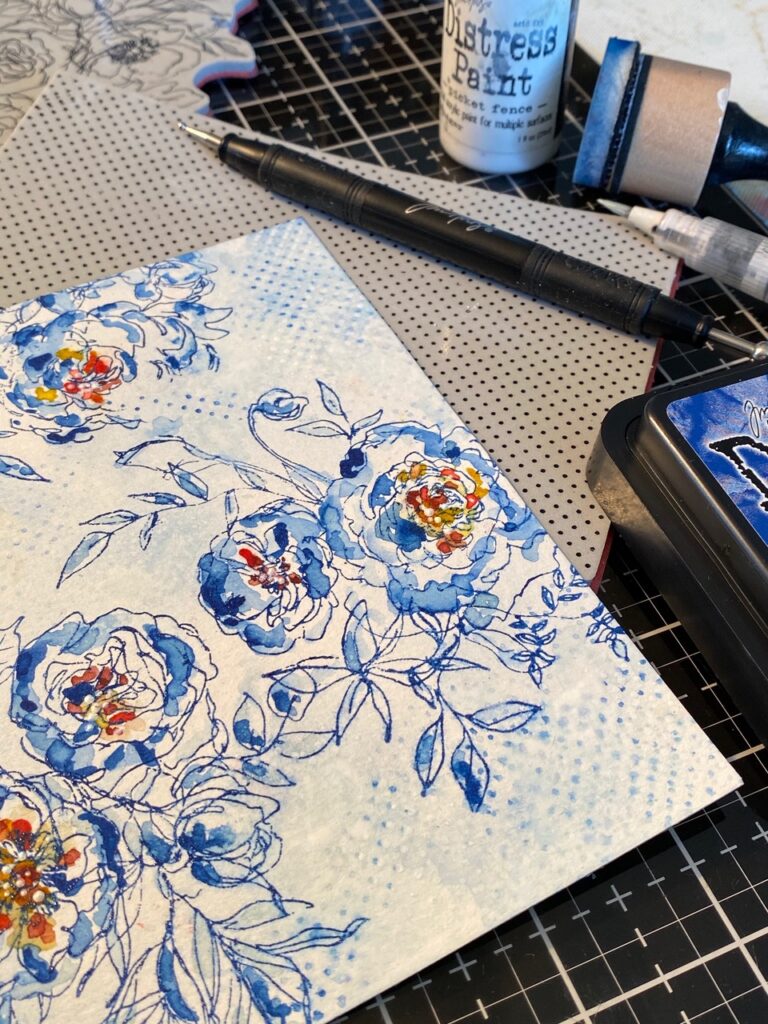
I started by stamping the 3 floral outline stamps randomly onto a piece of distress watercolor paper. I lightly sprinkled the stamped flowers with Prize Ribbon Embossing Glaze, then embossed the areas with my embossing tool. What I mean by lightly sprinkled… not all the stamped flowers received a thorough sprinkling of powder, meaning I specifically left some of the areas un-embossed. This way I could pull some color out of the stamped area using my Detail Water Brush without needing to use a dip of any of the color, just water. This also meant that the embossed areas remained a bit darker than the un-embossed areas and gave me more variance of color.
I smooshed my Prize Ribbon ink pad onto my craft mat, then picked up color using my Distress Detail Water Brush, then starting with very washed out shades began building my Prize Ribbon colors up, and dried with my heat tool in-between adding the shades. To get the very dark shades of color, I dripped a dot of the Prize Ribbon Reinker onto my craft mat and added it to the flowers.
I left the centers of the flowers plain from water or color, then using the water brush, dotted in shades of yellow, orange and red, again drying with my heat tool before adding each color into the mix.
I lightly inked up the dotted background stamp with Prize Ribbon ink, spritzed the stamp with water and lightly and randomly added dots into the open white areas of the paper. Then with my water brush, blended out some of the dots into the background.
I added some Picket Fence Distress Paint to the dot stamp, then again, lightly stamped white dots into the background. This added a little more depth to the background.
I dripped some paint onto my craft mat, then using my stylus tool, dotted some paint into the centers of the flowers.
The moth…
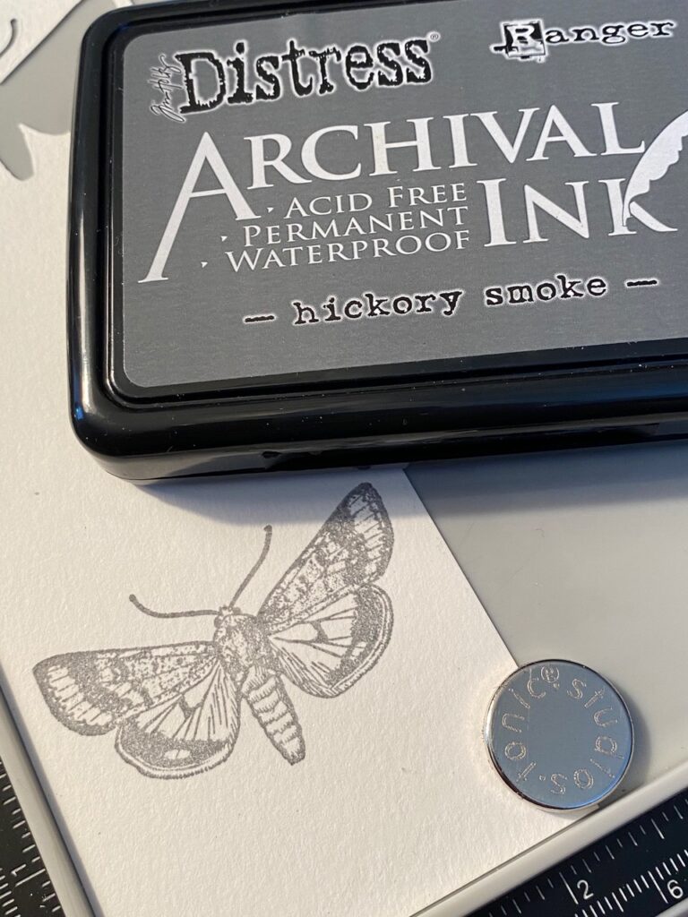
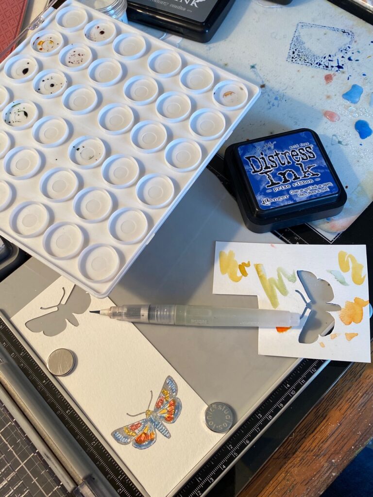
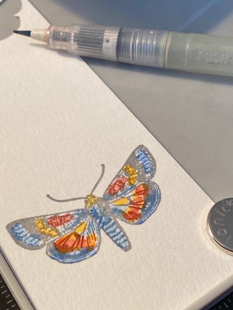
I stamped the entomology moth using the new Hickory Smoke Archival Ink pad and my Stamping Platform..leaving the moth stamp and paper that I worked on within the platform as it was watercolored.
Again, using my water brush, I picked up colors and watercolored the moth, then very quickly dried it with my heat tool. (be sure not to leave the heat of the heat tool over you platform for too long, just a couple quick shots are needed to get it dry-ish.)
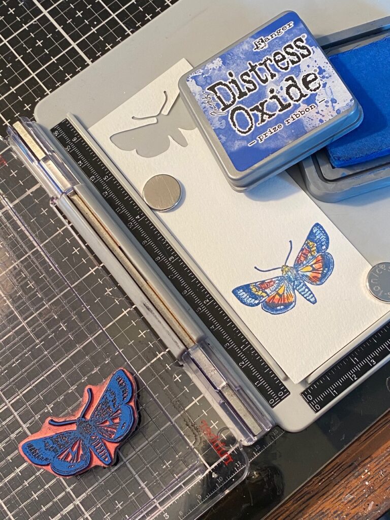
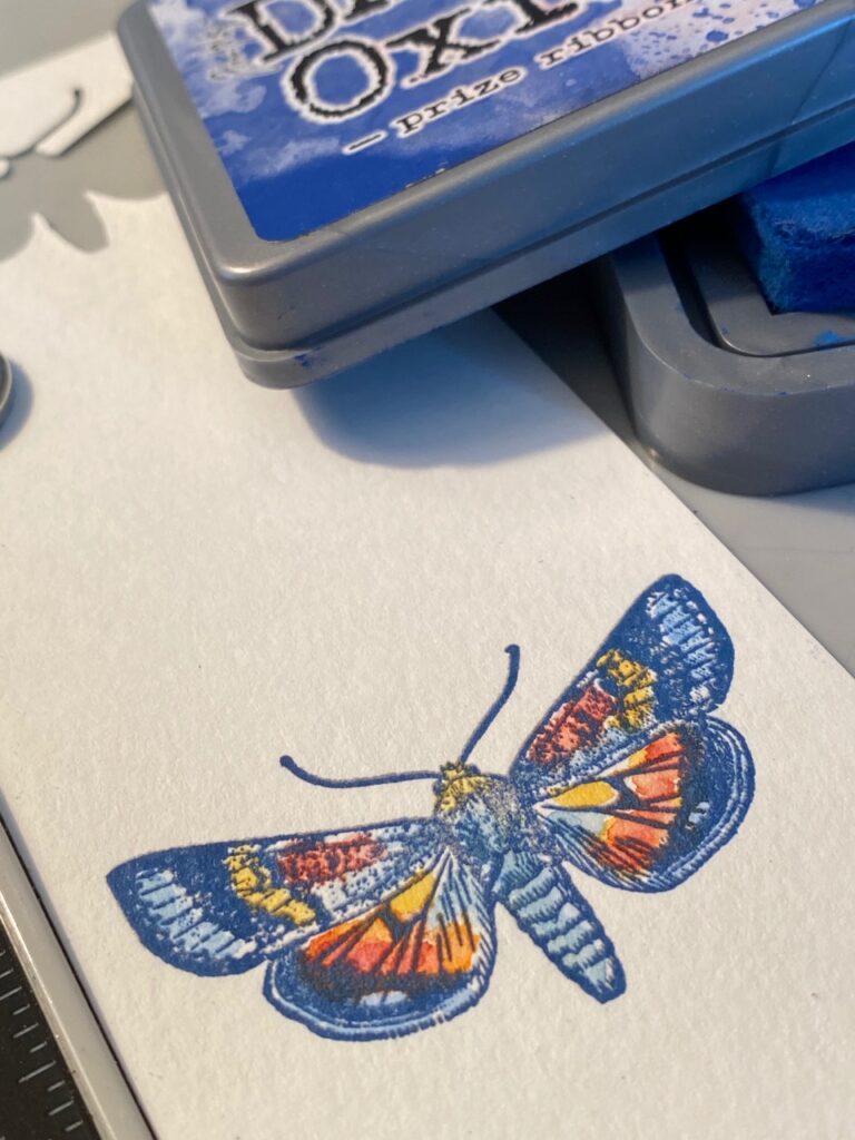
Once it was watercolored and dry, I then inked up the moth with Prize Ribbon OXIDE ink, then stamped over top of the colored moth. This is why I left the moth and paper that I was working on within the stamp platform.
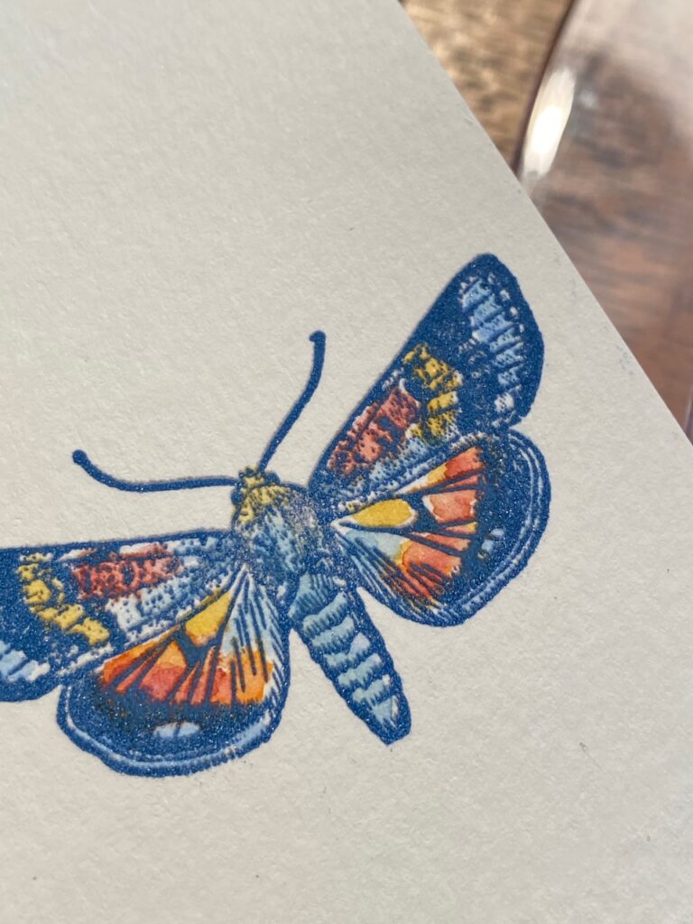
Stamping over top of the watercolored areas really makes the moth and watercoloring POP!
See what I mean??? So beautiful!!!
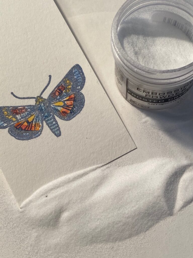
But, then I wondered if it needed a little more detail or depth to it, so I decided to sprinkle it with some frosted crystal embossing powder.
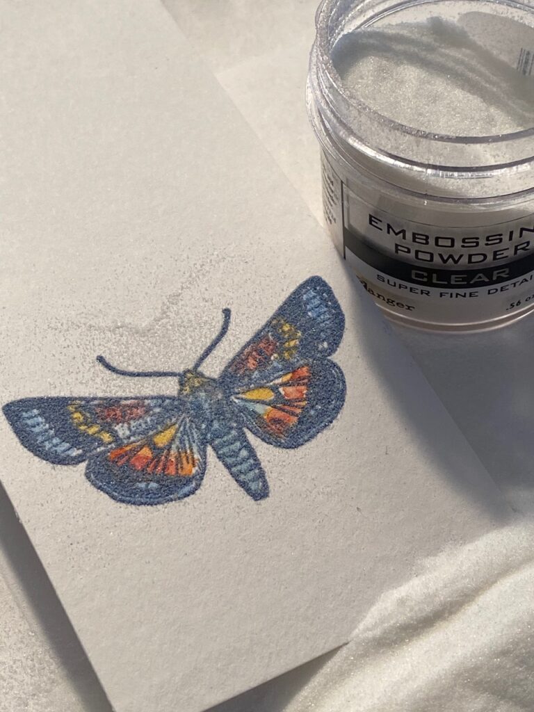
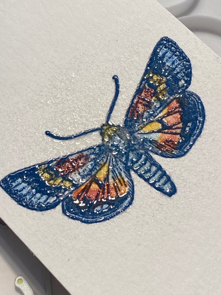
So, when I embossed it with my embossing tool, I couldn’t really notice much of a difference and was kind of bummed, I noticed it added a little dimension to it, but not the oomph that I was looking for… so instead of pitching it into the bin, I decided to heat it up with my embossing tool and while the powder was hot, sprinkle it with clear embossing powder…I am so glad that I did because I made a little discovery…
Check out that detail!!!!!
Then I thought, wait… is this more detailed because of the frosted crystal embossing powder that I had used??? So then I had to conduct a little experiment! I quickly watercolored another moth using the exact same colors, did all the same steps but this time DIDN’T use the frosted crystal prior and just embossed it with clear embossing powder and check this out…
The top moth is the one that was embossed with the frosted crystal and clear embossing powder…the bottom one was embossed with ONLY clear embossing powder. See the difference? The clear embossing powder one isn’t as detailed!! What? Weird, not sure why, but, for whatever reason, very cool! It might not make that big a difference to many, but to me, a detail geek, I was stoked! LOL!!

Now, moving on… I stamped, watercolored, trimmed and arranged labels, and cut out the moth using the Entomology Sizzix Thinlet set. I stitched around my background paper using my sewing machine and layered all the pieces onto the card base using foam adhesive and collage medium. Some scraps of thread were adhered just under the moth and a vintage button added for that shabby chic-ness. I stamped the phrase (Tiny Text CMS394) and trimmed it to fit just under the moth arrangement. I added another mat layer using a background stamp and stitched around the outside edge, then adhered all the layers together.
With that, my card was complete…
Thanks so much for stopping by today! Have a great rest of your Sunday!
Creatively yours,
Stacy

What is an affiliate program, and why should I click on the link and buy through you?
When you shop via the affiliate link on this blog, I receive a small commission from the affiliate provider (Simon Says Stamp) at no extra cost to you, whatsoever. These commissions help me to cover the hosting fees and other costs to run my blog and be able to provide you with FREE inspiration. If you shop the links, THANK YOU! I truly appreciate being able to share my love of creating with you.
Products used to create this make: Prize Ribbon Distress Products, Prize Ribbon Embossing Glaze, Floral Outlines CMS430, Label Frames CMS264 Correspondence CMS225, Entomology CMS328, Field Notes CMS396, Tiny Text CMS394, Dots and Floral CMS220, Detail Water Brush, Picket Fence Distress Paint, Vintage button, thread, sewing machine and more..



Absolutely wonderful. Thanks for the tutorial!
This is an absolutely stunning card! Thank you for the tutorial..can’t wait to get my supplies so I can play. Your talent is amazing. Keep up the beautiful work.
Just over the top beautiful! Love it.
Stacey, this is extraordinaire! I am partial to delft blue and white. This ticks every bucket for me. Thank you for the detail explanation around the butterfly. What a difference it all makes to the detail. I will certainly be pinning this make and using it to create my own little piece of art.
Beyond happy that you posted this tutorial!! I love this card! It is stunning! Your work is always so inspirational! Thank you Stacy!!
Wow, wow, wow! Thank you for such a wonderful tutorial and for sharing your creative Genius with us!! I always love your makes. Can’t wait to get these new stamps and ink!!!
Thanks ☺️
I’m definitely going to try this when my Prize Ribbon arrives. This make is absolutely beautiful! I love love love it! Thank you for the tutorial! 💙
Of all the makes featuring prize ribbon, this is my absolute favourite! Just love the way the colour reminds me of blue and white China. Thank you so much for sharing!
This is beyond words beautiful. When I saw it on Tim’s site I loved it. Thank you so much for the step by step guide.
Stacy your makes are always the highlight of the lives for me and this card was just exquisite. You used the colour so creativly playing with the intensity in all those imaginative ways. I love that you got out all the stamp sets, I can imagine the tidy up afterwards! Thank you for being such a generous soul and sharing this tutorial with all your ideas and the wonderful frosted crystal discovery. So glad you are still blogging. xox
Hello stacy,,i use verry often youre cards for my insperation ,,i always check your work first,,,i also got inspired by youre haunted house and the gate keeper,,,,and now you made this delft blue card,,so for a dutch woman like myself is that extra special thanks a lot for all youre bautiful cards ,,keep on making them than i will also,,special greetings from me out of holland,,,
Beautiful; details and coloring, great layering of it all!
This is simply stunning! I love the layering you did and that color just pops. Thank you for sharing your techniques and talents. 💕
This is just gorgeous. I enjoyed your step-by-step, it’s cool to see all the steps a card needs to be complete.